VISUAL IDENTITY
Some of you are probably wondering about the design concept behind the visual identity of Première Place...

The figure 1 is used to emphasize that we are given 1st priority, and that we are the founders, with unrivalled ambition and exclusive privileges.

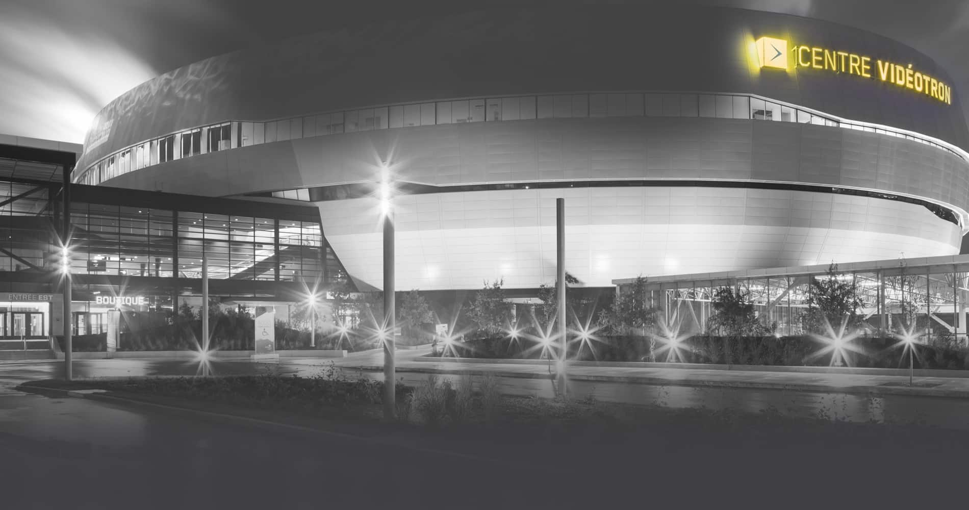
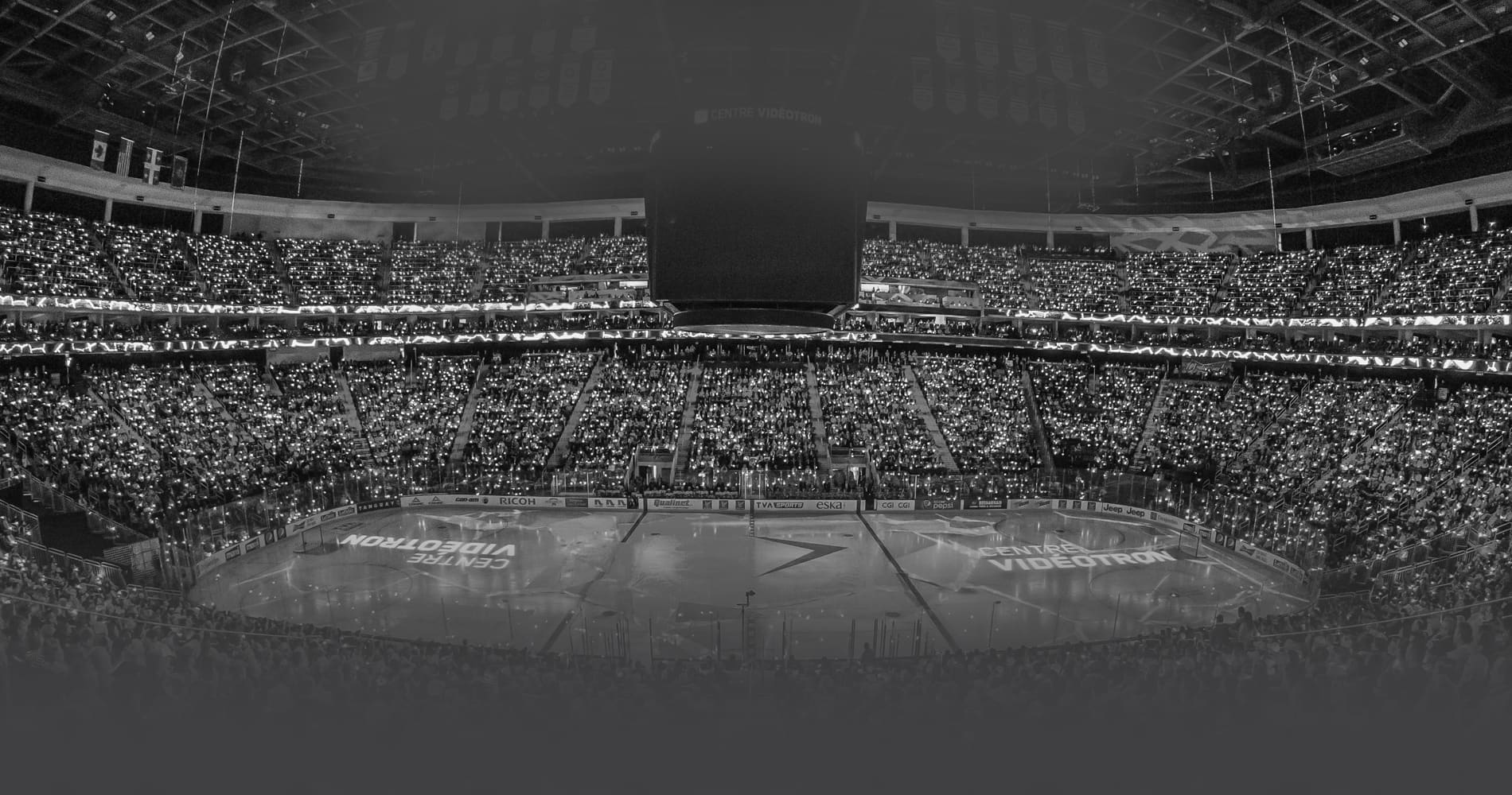
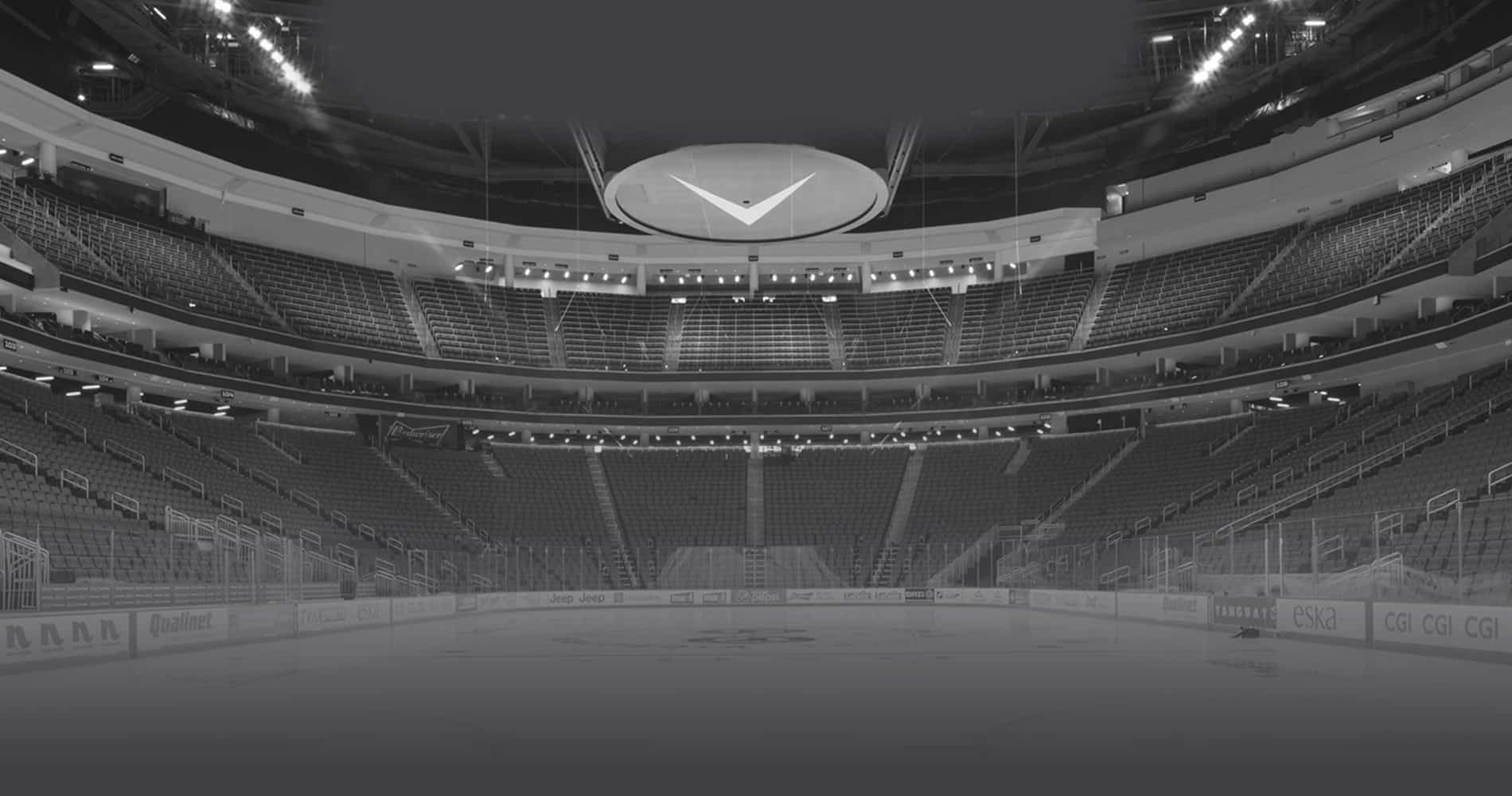
The oval shape represents the arena and its stands, signifying the realization of a dream years in the making.

Superimposing the oval shape over the number 1 creates a P for ‘Première’ and also echoes the P in ‘Place.’ This is to highlight the key role of J’ai ma place members in getting the project off the ground, and their continued support in bringing the arena to the forefront both at home and away.

The colour blue is cold yet bright, simultaneously evoking the Nordic climate of Québec, the Vidéotron Centre building and the ice on the rink.
